 |
Contrast Masking Examples
|
|
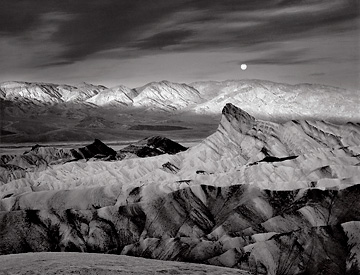
Moon
Over Zabriskie Point, 1980.
|
|
Straight
print before masking |
|
Final
print after masking Do not point to the above image Final image after applying a SCIM mask to the dark foreground areas. Note the crisp black accents which contribute to more richness in the dark values. On the fine print there is actually a perceived increase of fine detail in these areas (which isn't clearly seen in this low-res internet reproduction). Merely using a higher filter grade to print the lower portion of the image would not yield the same results. Also, substantial highlight brightening (using a Highlight Brightener bleach formula) was done to the entire sunlit mountain range in the background. If I were to use a higher contrast printing filter when burning the top half of the image it would not have had the extreme brightening effect that localized bleaching did and the sky values would be far too harsh. Some additional burning was done using a Fog Mask to precisely diminish some distracting bright areas. |
Click here to view an enlarged portion of the above image showing more detail
|
|
|||
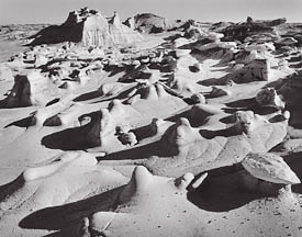
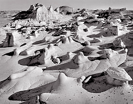
| Bisti Badlands, 1998. Near Farmington, NM. Straight print on left, final print on right. Original negative was 4x5 Tri-x shot with a yellow filter and given normal development. The straight print (left) was printed on grade 1 paper. The mid-tone and highlight contrast looks good, but the shadow areas are far too dark and lack luminosity and detail. Overall, the print looks very gaudy and harsh - not at all the intention I had for this photograph. This image is ideally suited to the use of a CRM mask followed by a SCIM mask. On the final image (above right), also printed on grade 1 paper to preserve the delicate highlight values, the CRM mask lightened the shadow values substantially (probably one to two full zones or values) and increased apparent edge sharpness while the SCIM mask brought richness and contrast back into the shadows by deepening the crisp black accents, giving the image a very tactile and luminous feeling. See the interactive example at the bottom of this page. | ||||
|
|
||
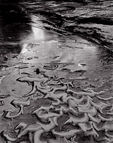
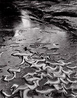
| Sand and Ice, 1978. Zion National Park, UT. Straight print on left is made without masks on grade 3 paper. Print on right was made on grade 3 paper also, but I used a Dodge Mask to lighten the frozen sand ripples, creating a very luminous and mysterious result. This mask only lightened the sand (without increasing local contrast) and gives a result similar to extremely detailed dodging. I also used a SCIM to deepen the fine black accents, further delineating the sand ripples from the surrounding icy water. | |||
|
|
|||
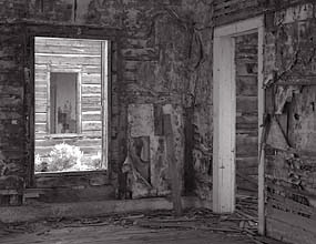
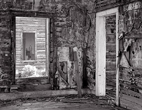
| Interior, Thinnes House, 1991. Piedmont, WY. Straight print (without masks) on left, final print on right. A special contrast mask was used to affect the contrast of all the interior values without affecting the values of the open window area. On the straight print (left), the interior values were a little too dark and "muddy", while the values in the window area are just right. I could have used two different contrast filters when making the print, a soft filter for the window area and a hard filter for all the interior areas. I chose instead to use a special contrast mask because the result was more controllable and repeatable. This technique allowed for a more accurate and seamless effect especially around the rectangular window area where the drastically different contrasts meet. The contrast enhancing effect of this mask is extremely versatile and can vary from subtle to extreme. | ||||
Interactive examples
rollover
the mask variations listed on the right to see mask effects
For proper viewing, please allow extra time for the
image variations to load.
If after a few minutes, all images do not load, please hit the refresh
button on your browser.
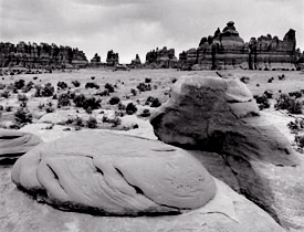
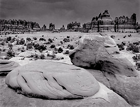
| Storm Over Chesler Park, 1977. Canyonlands National Park, UT |
Mask
effects
|
||
 |
 |
||
|
Straight
print (no masks)
|
|||
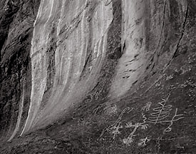
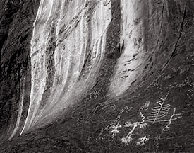
| Petroglyphs, 1987. Death Valley National Park, CA |
Mask
effects
|
||
 |
 |
|
|
|
Straight
print (no masks)
|
|||
|
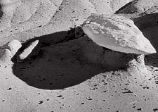
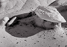
Bisti
Badlands (cropped section).
|
Mask
effects
|
||
 |
 |
||
|
Straight
print (no masks)
|
|||
My
First Contrast Mask - Contrast Masking Is Easy!
Pin-Registration Carrier Systems | Contrast
Masking Kits | Masking Examples
| Masking Basics | Photography
Workshops
| Digital vs. Traditional
| Frequently Asked Questions | Ordering
| E-Mail |
Radeka Photography - more info | Home |
All
photographs on this site are copyright © Lynn Radeka. All rights
reserved.
Precision
Pin-Registration Carrier System copyright © 2002 Lynn Radeka. Patent
pending.
Contrast Masking Kit copyright © 2000 Lynn Radeka.
